Intro
In my article on choosing a school in Wake County, I used EVAAS growth scores along with EOGs to prioritize schools for my son. At the time, I could find little documentation on EVAAS and decided to put more emphasis on the EOG scores.
Since then, more digging turned up this white paper from SAS. The white paper outlines the model form and explains how certain metrics are generated. There are enough formulas to scare off laypeople, but their fixed effects matrix is not published for statisticians. In short, the model remains a black box. (Bonus: for a better intro to mixed linear models like EVAAS, see this one from UCLA. It uses doctors/patients rather than teachers/students but is otherwise the same.)
While reverse-engineering the model is impossible, I decided to investigate the results for potential bias.
Investigating EVAAS
Imagine someone claimed to have a cube, but they wouldn’t let you examine it first hand. Instead, you could only see pictures of the six sides (top, bottom, left, right, front, and back). You would expect each of those pictures to look like squares. If they didn’t, you would know it wasn’t a cube.
SAS claims the EVAAS model is a robust measure of achievement for teachers, schools, and districts. Importantly, it is supposed to account for things like race, socio-economic status and district by tracking the same children over time. We can’t see the model, but we can look at the results from several angles to investigate their claims.
The chart below provides one angle. Each dot is a school. Its position is based on its EVAAS growth score (y-axis) and the percent of Asian students attending (x-axis). If the test was fair, the dots should be randomly scattered around a growth index of 0. Instead, schools tend to get better EVAAS scores as the percent of Asian students increases.
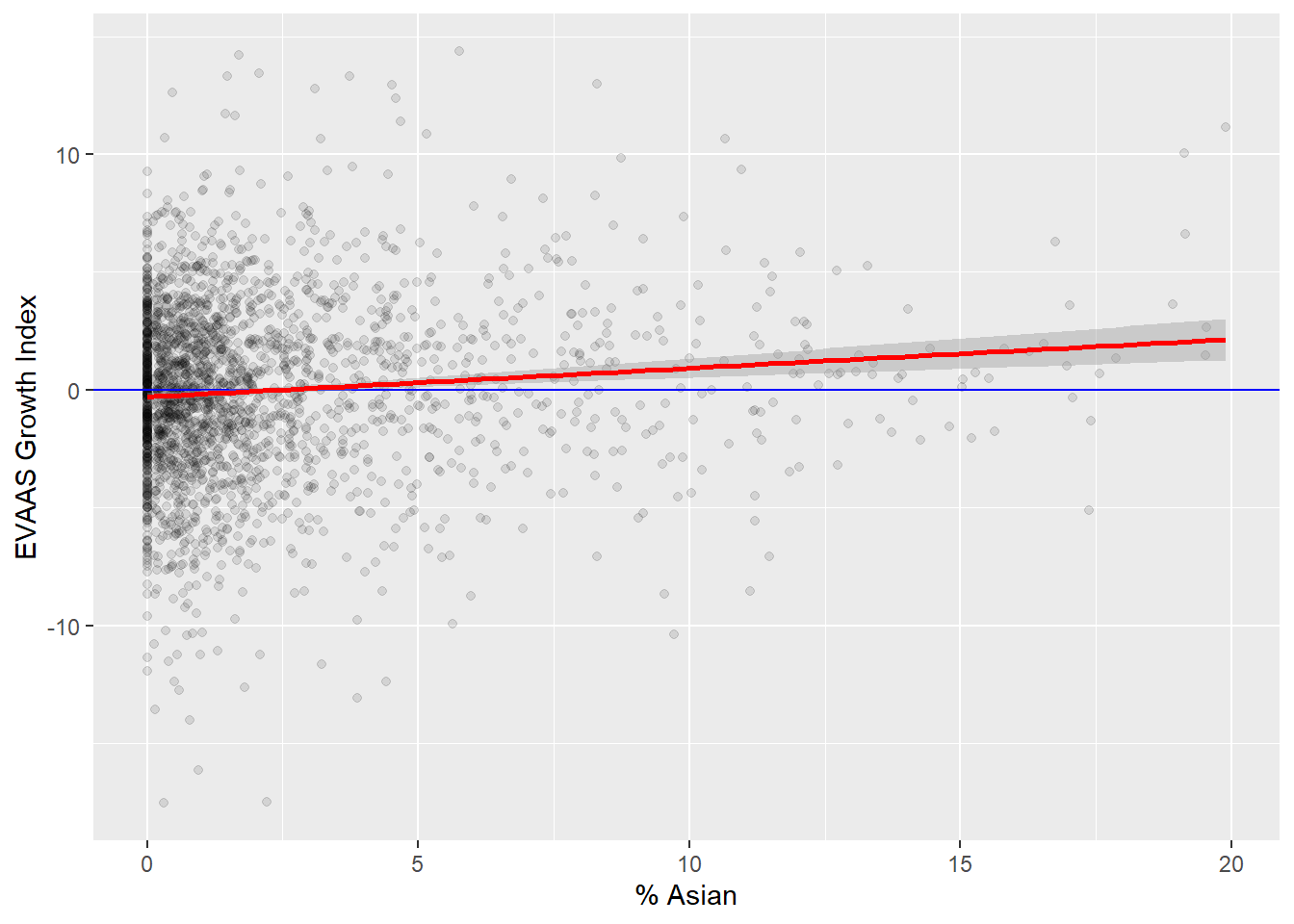
This method of investigation isn’t conclusive. It is possible that the test is fair, but that Asian parents favor (and can afford) areas within school districts that have better schools. Even so, the growth expectations for Asian students should (in a fair model) adjust over time to account for this.
The chart below plots EVAAS scores compared to the percent of Black students at each school. It shows a troubling trend in the opposite direction. Schools with more Black students receive noticeably lower EVAAS scores.

These findings are consistent with an analysis of the Houston Independent School District published in the education journal Phi Delta Kappan (link). The authors had access to individual teacher scores, and they found that teacher scores were correlated with race and subject matter. While the article takes a strong anti-EVAAS position, it also points out that there are competing interpretations for these findings.
The charts below are included primarily for completeness. They show the EVAAS scores along all the dimensions I have access to. Each plot is like looking at one side of the EVAAS model “cube”.

Conclusion
SAS claims the EVAAS model is fair because student growth expectations account for factors like race and school district. Instead, scores are still correlated along racial and economic dimensions. While this doesn’t prove the model is unfair, teachers and schools with large disadvantaged populations should expect more transparency from a system that claims to grade their value.