The motivations for this post are simple:
- There is a wealth of data on the COVID-19 pandemic.
- That data is misrepresented on a daily basis.
The most egregious sin is presenting counts of new cases without accounting for increased testing. This distorts comparisons between states (and countries) but also misrepresents temporal trends within them. I present the numbers both ways in the analysis below and also offer an interactive application for viewing the data. In addition, I compare the experience of states in general and California to New York explicitly to offer some data-driven insight as to why states had such drastically different experiences.
My primary source for COVID-19 data is https://covidtracking.com/. All data/code is linked at the bottom of the article.
National Data
New Cases
The chart below shows the number of daily new cases and the 7-day trend. This chart suggests that we saw a modest reduction in new cases and are now poised to see an explosion. It’s alarming and has prompted renewed wall-to-wall news coverage of a “second wave”. It looks (incorrectly) like an approaching tsunami.
The above graph has been presented in various forms by practically every news outlet. It is also misleading. The chart below presents the same new-case data in blue but also includes the number of negative tests shown by tan bars. The amount of tests that come back negative is growing much faster than those that come back positive.
To accurately present the trend of new cases, they must be shown as a rate per 100 tests performed. With this metric, you can determine if the virus is spreading or if we are simply doing more tests. The rate of new cases has begun rising in the past few days, but these charts present a reality that is much less alarming.
It is also worth noting that the high rates of positive cases in April were in part the result of limited tests being reserved for people with COVID-like symptoms. As testing increased, a more accurate measure of the infection rate has emerged.
Hospitalizations
Tracking daily hospital usage is a better way to gauge the impact of COVID-19. This metric is not biased by issues with sample size or frame. In the chart below, each bar represents the number of people in the hospital on that day due to the virus. This metric fell from late April to mid June, but has risen in the past four days.
Deaths
Similar to hospital usage, COVID-19 deaths offer a metric that is easier to interpret. Deaths have fallen since late April; however, deaths are a lagging indicator. In a second wave scenario, you would expect to see hospitalizations go up first followed by rising deaths. The bar on June 25th is an odd data point and likely a data reporting issue. (The New York Times data lists a similar figure of 2,466.)
National Summary
Perhaps the most important take away from the above review is that daily hospitalization rates are likely the best statistic to broadcast to the public. They don’t require adjustment based on the amount of testing or lag behind as much as death statistics. Absolute counts of new cases are the worst metric, but this is where most news media are focused.
State Data
While the nation as a whole is trending in the right direction, policy decisions are made at the state level and individual states could be moving in opposite directions. Different experiences in each state may also create natural experiments for us to examine. In addition to the analysis I present here, I’ve created an interactive viewer for the state data. Click the image below to open the app and choose which metric to view, see trends for each state, and compare states to each other.
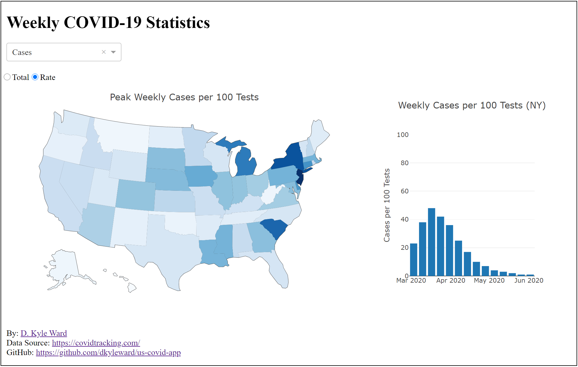
New Case Rate
The table below shows the rate of new cases per day for a handful of states. Issues with the daily state data create some noise, but the different patterns are easy to see.
Death Rate
At the state level, comparing absolute deaths would be misleading. States like New York and California will tend to have more deaths simply because they have more people. As I did with new cases, I convert deaths to a rate: deaths per one million people. Even with this adjustment, the chart below shows how severe the problem became in NY compared to other states.
Regional Differences
The animation below shows the rates of hospitalization and death on a weekly basis colored by region of the country. A state that experienced any week with a death rate above 50 per million is labeled.
- x-axis: deaths per million
- y-axis: hospitalized per million
- circle size: state population (Census ACS)
- color: region
Press “Play” to see two primary patterns emerge:
- The separation of the northeastern states around New York City.
- Hospitalization and death rates have been falling for nearly all states in the past few weeks.
Note: The states not reporting hospitalization data run along the x-axis only
New York City
New York City is the densest city in the US, has the most air travel, and has transit ridership that dwarfs other cities. These factors make it a hotbed for viral transmission. The map below shows the peak death rate experienced in each state, and the impact of New York City can be seen in the surrounding states. Outside of the northeast, the peak death rates are much lower. Louisiana stands out in the south, which the CDC attributes to Mardi Gras.
Comparison to California
California is the most populous state, but compared to New York, it’s experience with the virus has been far less severe. Comparing the two states reveals important similarities and differences that could explain the divergence. One important similarity is that they initiated stay-at-home orders within a day of each other.
Density
New York City is the largest, densest city in the country. The table below shows the top 10 US cities ranked by population density (source). San Francisco is second on the list, but has only 1/10th the population. In fact, all the Californian cities in the table combined only hold 1.4 million people compared to NYCs 8.3. This disparity in population and density is a significant reason why NYC had a more severe outbreak.
| City | State | Density | Population |
|---|---|---|---|
| New York | New York | 28,317/sq mi | 8,336,817 |
| San Francisco | California | 18,569/sq mi | 881,549 |
| Jersey City | New Jersey | 17,848/sq mi | 262,075 |
| Paterson | New Jersey | 17,500/sq mi | 145,233 |
| Cambridge | Massachusetts | 17,289/sq mi | 118,927 |
| Daly City | California | 14,009/sq mi | 106,280 |
| Boston | Massachusetts | 13,938/sq mi | 692,600 |
| Miami | Florida | 12,599/sq mi | 467,963 |
| Santa Ana | California | 12,333/sq mi | 332,318 |
| Inglewood | California | 12,160/sq mi | 108,151 |
Air Travel
Air travel is another important consideration for viral spread. The table below shows the top six US metro regions in terms of air travel (source). While NYC tops the list, Los Angeles and San Francisco are not far behind. One potentially important difference not captured below is that NYC attracts more European tourists, which is where their virus originated. This may or may not prove significant after further study.
| Metro | Yearly Passengers | Airport(s) |
|---|---|---|
| New York City | 134,353,971 | JFK, Newark, LaGuardia, Stewart, Long Island MacArthur, Westchester |
| Atlanta | 104,171,935 | Hartsfield–Jackson |
| Los Angeles | 102,630,641 | LAX, Long Beach, Bob Hope/Burbank, John Wayne, Ontario |
| Chicago | 101,202,068 | O’Hare, Midway, Rockford |
| Miami | 80,054,002 | Miami, Fort Lauderdale, Palm Beach |
| San Francisco Bay Area | 75,966,974 | San Francisco, Oakland, San Jose |
Transit
Crowded buses and subways are an excellent place for viruses to spread. In my post on transit ridership trends, I used the chart below to show just how much larger the transit market is in NYC compared to the rest of the country.
Unlike the modest difference in air travel, NYC transit is 9.7 times larger than the largest market in California during normal operation. People crammed into enclosed spaces on the NYC city subway were primed to spread the disease. As the virus spread, San Francisco closed their subway while Los Angeles cut back transit service after steep drops in ridership. NYC also saw reduced ridership and ran reduced service, but they only closed the subway between 1:00 am and 5:00 am.
The chart below updates my original 2019 chart with April 2020 data. During the peak of the viral outbreak, NYC still recorded more than twice the ridership of Los Angeles.
Weather
Weather also differentiates California from New York. The chart below compares average temperatures in San Francisco and Los Angeles with New York City (source). California remained noticeably warmer than NYC through early April. There is still debate over the influence of weather on COVID-19, but some researchers think it could behave like it’s well-known coronavirus cousins.
What about Lockdowns?
Lockdowns are the first factor many consider when COVID-19 outbreaks between states. Intuition might suggest that states with weak or no lockdown restrictions would have higher rates cases, hospitalization, and death. Instead, the comparison of California to New York shows that other factors are more likely to impact severity.
The animation from before is now color coded by lockdown duration (source). What it shows is that northeastern states implemented longer lockdowns in response to a much more severe viral outbreak. Outside of the northeast, states adopted different approaches and no clear pattern emerged showing that longer or shorter durations made any meaningful difference.
Conclusion
One of the unique things about the modern day is the abundance of information. This is a great benefit, but it is important that we use and present that information responsibly. Raw counts must be handled appropriately before making comparisons across time or geography. Failure to do so will lead to poor decision making.
The severity of the virus has varied across the country and is likely driven by underlying differences like density, transit utilization, and weather. Rural states with shorter or no lockdowns had milder outbreaks than the northeast in spite of stronger restrictions. Finally, a second wave does appear to be forming as states re-open. This fact alone does not make it clear what the right policy response should be. Lockdowns have negative consequences for our lives and livelihoods. Trade offs between these impacts and viral spread are difficult to balance.
Reproducibility and Data
All the data and code used to perform this analysis is available on GitHub:
Other sources of interest:
https://covidtracking.com/
NY Times Data