My oldest is entering Kindergarten next year, and I want to answer two big questions:
- What are the best public schools he can attend?
- Are private options worth the cost?
What follows in this article is my dive into the deep end of school performance metrics and how I use them to make a (hopefully) informed decision. Of course, the choice of school depends on more than test scores, but they are a critical consideration.
It is also my hope that this post introduces helpful resources to others going through the same process. All of my sources and data are listed at the bottom.
Two main testing metrics
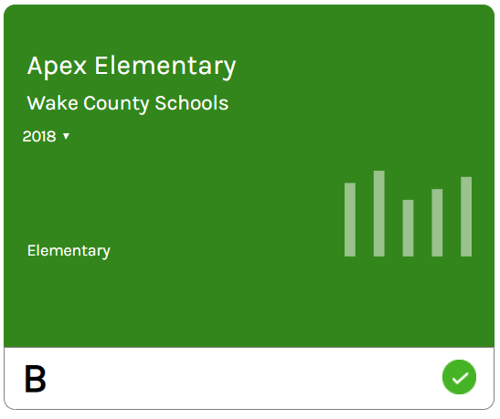
If you look at the report cards prepared for Wake County Public Schools, you’ll see that they each have two metrics:
- A performance score
- Measured by End of Grade tests (EOG)
- Represented by the letter grade of the school.
- A growth score
- Measured by the Education Value-Added Assessment System (EVAAS)
- Represented by the color of the school
I’m familiar with the EOG tests. I took them as a kid, and the letter grade for each school is a pretty straight-forward measure to interpret. An “A” means that kids got a lot of questions right and a “D” means they didn’t.
The growth score is new to me, but given how prominent the color of the school is compared to its letter grade, it seems important.
Should I consider growth scores?
Student growth appears to be a better measure than just performance. Consider two third-grade teachers:
- Teacher A
- Starts with a class of children reading at a first-grade level.
- At year-end, they are reading at a third-grade level.
- Teacher B
- Starts with a class of children reading at a fourth-grade level.
- At year-end, they are still reading at a fourth-grade level.
Based on the EOG exam, Teacher B looks better because her children can read at a higher level. Looking at student growth reveals that Teacher A is doing a better job.
The goal of EVAAS and other value-added modeling is to isolate the role of the teacher in student learning and control for things like socio-economic status or previous competency level. For a given student, EVAAS makes a growth prediction based on various factors. How the student performs compared to this prediction is the growth score.
The scatter plot below compares school EOG and growth scores. It includes all schools in Wake County that offer elementary grades. Along the x-axis is the percent of students that scored at or above level four on the EOG (College and Career Ready or CCR). The y-axis shows the growth index where scores between -2 and 2 mean that students were learning at the expected rate. Schools above 2 exceeded growth expectations while schools below 2 fell short.
The relationship between the two test scores is represented by the dashed blue line, but it isn’t very strong (R2 = .12). It suggests there is only a minor relationship between performance and growth, which is counter-intuitive to me. It may be right but warrants further investigation.
Unfortunately, I am unable to find more than vague references to how the EVAAS scores are calculated. I can’t find a statistical model or published documentation from SAS (creators of EVAAS). I asked a teacher friend of mine and quickly learned that I wasn’t the only one. Teachers are in the dark like everyone else, and they aren’t happy about it.
I am wary of undocumented statistical models. Perhaps there is validation work I’ve not seen demonstrating that the models can be trusted, but I decided to put more weight on the EOG scores and use the EVAAS system as a secondary point of reference.
Data on private schools
Another thing I learned was that the EOG and EVAAS don’t apply to private schools, which complicates comparisons. Private schools are required to do yearly testing, and the private schools I contacted all use the Iowa Test of Basic Skills (ITBS). Unfortunately, I could not find a public database of scores, and instead requested them directly from select schools. I also discovered the National Assessment of Educational Progress (NAEP), which is administered to both private and public schools in fourth, eighth and twelfth grades, but viewing data by school requires a license.
School demographics
The test scores in the scatter plot above are performance measures for the schools in aggregate. Several studies, including one using the NAEP data, suggest that achievement differences between schools are due more to demographic differences than anything else. This may justify the weak relationship between EVAAS and EOG scores. It does mean that school composition is critical. Several online sources show the demographics of individual schools (example), but I found it helpful to map the data to see many at once.
Race
The map below shows the racial composition of the public, public charter, and private schools in Wake County. Click on a pie chart to see the stats as well as the school type.
Free Lunch
The second map shows the proportion of students qualifying for free lunch. Note that private schools are not included in this map.
Breaking down test scores
The school demographics are very different, which limits the usefulness of aggregate school metrics. What I need is to compare students from similar groups between schools.
Before breaking down test scores further, I narrowed the list of schools to those near my home. While we can attend any charter or private school, proximity makes the daily routine much more convenient and allows me to be more active in the school.
These are the schools I investigated in more detail:
- Penny Road (public - our traditional calendar option)
- Oak Grove (public - our year-round option)
- Peak Charter (public - charter)
- Thales Academy (private)
- Resurrection Lutheran (private)
Public options
First, it is helpful to see where the public schools fall on the scatter chart from earlier.
Peak Charter outperformed Penny Road and Oak Grove in both EOG and EVAAS scores. Based on this plot (and my preference for EOG over EVAAS), my initial ranking of public options was:
- Peak Charter
- Penny Road
- Oak Grove
From the maps above, I know that Peak Charter has a lower percentage of students that qualify for free lunch and a different racial mix. Does this explain the performance difference? The chart below breaks down the EOG scores by school and student subgroup. In short, every subgroup (including economically disadvantaged) scored better at Peak Charter. The exception was white students, but the difference in their performance is small compared to how well they score at all three schools.

The second chart shows the EVAAS growth index broken down in the same manner. While I decided to put less emphasis on it, it is worth a review. Peak is the clear winner here, too.

The detailed scores do not change my initial ranking of public options.
Private options
Thales provided their 2018 ITBS scores. Kindergartners scored better than 94% of the students nationwide while fifth-graders scored better than 82%. The decline is concerning, but there could be several explanations (e.g. new students joining Thales in later grades that are behind).
Resurrection Lutheran did not provide detailed scores, but they did provide a copy of their letter to parents from 2018. Their students did very well, with most classes scoring at 90% or above.
Comparing public and private
The easy decision is to select Peak Charter Academy as my preferred public option. Of course, admission to Peak is done by lottery, so it isn’t guaranteed.
It is harder to answer the second question: if private schools are worth the money. It is impossible to compare private and public directly given the different tests used.
While researching the history of testing in NC, I realized the ITBS was used for public schools by North Carolina until the 2001-2002 school year. While private schools are still required to do yearly testing, they stopped for public schools.
The Iowa Tests of Basic Skills (ITBS) will be eliminated from the North Carolina state testing program beginning in the 2001-02 school year. The basis of this decision by the North Carolina State Board of Education was two-fold: (1) to allay public concern regarding excessive testing and (2) to accommodate pressing budgetary constraints. (source)
Figure 13 from the same report shows the ITBS scores from 1996-2001.

These scores aren’t encouraging, but it’s important to remember that they are statewide scores (and old). Based on my research, I expect the scores from Wake County to be higher than the state average and the scores for Apex schools to be higher than the average for Wake County. Still, guessing where they would score today is no simple task.
The private schools certainly had high ITBS scores in 2018, but their attendance is heavily skewed toward Asian and White students. These are the highest-performing demographic groups across the county. It is hard to say how much of the private ITBS scores are due to simple demographics.
Conclusion
None of our schools look like bad options, and we will tour them all. As of this moment, my top choice is Peak Charter. If we win the lottery, it makes the decision easy. If we don’t win, then deciding between Penny Road and Resurrection Lutheran will be difficult. It will likely come down to school culture, personal preferences, and whether or not we can afford tuition.
Reproducibility and Data
All the data and code used to perform this analysis is available on GitHub:
Summary of Resources
I encountered many great resources during my investigation.
NC Report Cards
Raw Test Scores
School GIS points
Private Demographics
Public Demographics
National Report Cards (NAEP)
Every public school (non-charter) in Wake County has a School Improvement Plan (SIP) that you can view online. This is a candid, introspective look by the school at what they need to do to improve. The links below provide the login information to view that school’s SIP on a system called Indistar.
Another great resource is https://www.greatschools.org/. You can get detailed information for each school along with reviews. For example: Penny Road.